
What is UI/UX design — and why do businesses need it?
Research-backed interfaces and interaction design from Taylance Tech — so your product feels clear, consistent, and buildable, not pretty slides that collapse in engineering.
UI/UX design means shaping how people understand and use a digital product: the structure of tasks, the layout of screens, the visual system, and the feedback that tells users what happened. UX covers flows, information architecture, and usability. UI covers the visual and interactive layer people see and touch.
Businesses need this work when confusion, drop-off, or support tickets show that features exist but people cannot complete jobs cleanly. They also need it when a product grows screen by screen without a shared system — so every new page looks different and engineering reinvents components. Design is not decoration; it is how software becomes usable and trustworthy.
Teams often arrive with a feature list and a hope that “making it modern” will fix conversion. Modern styling without clearer flows rarely helps. Professional UI/UX starts from who the user is, what success looks like, and which constraints engineering and content will face.
Another common gap is treating design as a single deliverable date. Products change; so must the interface language. Good engagements leave you with patterns and files your team can extend, not a frozen set of pictures that rot after the first new feature.
Taylance Tech delivers UI/UX as a professional service: discovery, flows, wireframes, high-fidelity interface design, interactive prototypes, design systems, accessibility-minded decisions, and handoff packages your developers can implement. We design for buildability — not for awards that ignore implementation cost.
Problems
Problems that push teams toward UI/UX design
These product pains appear before buyers search for a design partner.
Users bounce before completing the main job
Signup, checkout, or setup dies mid-flow because labels, steps, or empty states never made the next action obvious.
Screens look unrelated across the product
Each feature was designed in isolation. Spacing, type, and controls drift until the product feels unfinished.
Engineering rebuilds the same components repeatedly
Without a shared library, buttons, forms, and tables are reinvented — wasting time and creating uneven behavior.
Stakeholders argue from taste instead of evidence
Reviews become opinion contests because flows were never tested and goals were never written down.
Mobile feels like a shrunk desktop
Critical actions hide behind cramped layouts. Touch targets and priority content were never designed for small screens.
Handoffs that leave developers guessing
Static mockups without states, edge cases, or specs create delays and “close enough” implementations.
Services
UI/UX design services we provide
Engagements aimed at clearer products — not mood boards without structure.
Research and usability evaluation
Interviews, task analysis, heuristic review, and usability tests that reveal where people struggle before you invest in polish.
Flows, information architecture, and wireframes
Task maps and low-fidelity structures that settle navigation and content priority before visual detail hardens the wrong path.
High-fidelity interface design
Clear visual systems for web and mobile products: type, color, spacing, components, and states that match your brand and context.
Interactive prototypes
Clickable journeys in Figma so stakeholders and testers can experience the product before engineering commits.
Design systems and component libraries
Reusable components, tokens, and documentation so teams ship consistently as the product grows.
Accessible, responsive product design
Layouts and patterns that work across devices and respect contrast, focus, and keyboard-friendly interaction where it matters.
Guides
Related reading
Vendor-neutral guides on related topics — written to be useful on their own.
Browse the full collection on all guides, or read engineering articles on our blog.
Definition
What professional UI/UX design includes
A practical definition for product and business buyers.
UI/UX design services plan and craft the experience of a digital product: how people find their way, complete tasks, understand feedback, and trust what they see. That work spans research, information architecture, interaction design, visual design, prototyping, and preparation for engineering.
Professional delivery includes clear problem framing, structured flows, interface systems that can grow, documentation of states, and handoff assets. A mood board or a single homepage mockup is not a complete product design outcome.
Taylance Tech designs so your team can ship. Beauty matters, but clarity, consistency, and buildable detail decide whether design becomes software or a forgotten file.
- User goals and success metrics written early
- Flows and wireframes before heavy visual investment
- Components and states documented for engineering
- Responsive and accessibility considerations included
Why businesses need it
Why businesses need UI/UX design
When product success depends on people completing work.
Businesses need UI/UX design when customers or staff cannot complete important tasks without help. Support load, abandoned funnels, and “where do I click?” feedback are design problems as much as engineering problems.
They need it when brand trust is damaged by uneven interfaces. People judge credibility from layout, typography, and coherence long before they read your about page.
They need it when engineering velocity drops because every screen invents new patterns. A design system is an operations investment for product teams.
They do not need endless exploration for a tiny static page. Scope should match risk. We will recommend a lighter package when the problem is small.
UX vs UI
UX and UI: different jobs that must work together
Clarity for stakeholders buying design services.
UX design focuses on structure and behavior: who the user is, what steps they take, what information they need, and how the product responds. It answers whether the journey makes sense.
UI design focuses on presentation and interaction detail: hierarchy, controls, spacing, color, type, motion cues, and visual consistency. It answers whether the journey feels clear and credible on screen.
Separating them completely creates friction. Pretty UI on a confusing flow still fails. A smart flow with chaotic visuals still feels untrustworthy. We keep both in one delivery rhythm.
When budgets are tight, we still sequence UX structure first. Polishing the wrong path is the most expensive kind of design waste.
Research
Research that is right-sized for the decision
Evidence without research theater.
Not every project needs a month of interviews. Research should match the risk of being wrong. A redesign of checkout deserves more scrutiny than a settings label tweak.
We use stakeholder interviews, existing analytics, support themes, competitive pattern reviews, and usability tests on prototypes or current products when access exists.
Personas are useful when they describe jobs and constraints — not fictional biographies. Journey maps are useful when they expose friction points you will actually redesign.
We document findings as decisions: what we learned, what we will change, and what remains uncertain. Research that never changes the design was entertainment.
Flows
User flows and information architecture
Making the path obvious before pixels get precious.
Flows describe how someone moves from entry to success — including branches for errors, permissions, and empty states. Skipping those branches is how “happy path” designs fail in production.
Information architecture decides what is primary, secondary, and buried. Navigation is a product decision, not a decoration choice.
We pressure-test flows against real roles. An admin and an end user rarely share the same first screen priorities.
Wireframes keep discussion on structure. Debating button gradients before the steps are right wastes everyone’s patience.
Visual design
Visual interface design that supports the job
Hierarchy and brand without noise.
Strong UI uses hierarchy so the eye finds the next action quickly. Type scale, contrast, spacing, and grouping do more for usability than ornamental detail.
Brand expression belongs in the system: color roles, typography personality, imagery rules, and component styling that can repeat. One beautiful screen that cannot spawn a library is a dead end.
We design default, hover, focus, disabled, loading, empty, and error states for critical components. Missing states become engineering improvisation.
Density should match context. A trading dashboard and a marketing landing page should not share the same whitespace philosophy.
Prototypes
Prototyping before expensive engineering commits
Feeling the product while changes are still cheap.
Interactive prototypes help stakeholders stop imagining and start clicking. They also support usability sessions where you watch someone attempt a task.
Prototype fidelity should match the question. Low fidelity tests structure; high fidelity tests comprehension of labels, hierarchy, and visual trust.
We avoid prototypes that imply unavailable motion or micro-interactions engineering cannot afford. Honest fidelity builds better decisions.
Prototype review still needs a facilitator who asks task questions. Silent scrolling through frames is not validation.
Design systems
Design systems and component libraries
Consistency that speeds shipping.
A design system is a shared language: tokens for color and type, components with variants, and rules for when to use them. It reduces debate and rework as teams grow.
We start systems from real product screens, not from abstract component museums. Libraries that do not appear in journeys gather dust.
Documentation matters: naming, usage do’s and don’ts, and accessibility notes. A Figma file without guidance still produces inconsistency.
Systems evolve. We plan for contribution and versioning so engineering and design do not silently diverge after handoff.
Responsive
Responsive and multi-device product design
Designing for how people actually hold the product.
Responsive design is more than stacking columns. Priority content, touch targets, and navigation patterns must change thoughtfully across breakpoints.
We design key screens at relevant sizes early — not only desktop then a squeezed afterthought. Mobile-first is useful when mobile traffic or field use dominates.
Tables, filters, and dense admin tools need special treatment on small screens. Hiding complexity poorly is worse than offering a simplified mobile path.
Cross-device consistency should mean shared language, not identical layouts that fail context.
Accessibility
Accessibility as part of quality design
Inclusive patterns planned in the interface — not bolted on later.
Accessible design includes readable contrast, visible focus, sensible heading structure, labels for inputs, and interaction that is not mouse-only when keyboard use is expected.
We make accessibility decisions in components and templates so engineering inherits better defaults. Retrofitting contrast and focus after launch is slower and uglier.
We will not claim legal compliance guarantees. We will design with WCAG-minded practices and call out risks we see in reviews.
Accessibility also improves clarity for everyone: better labels and hierarchy help all users, not only assistive-technology users.
Handoff
Design handoff that engineers can trust
Closing the gap between Figma and production.
Handoff includes organized layers, named components, spacing and type specs, asset export rules, and notes for behavior that static frames cannot show.
We include edge cases: long text, empty lists, permission denials, validation errors, and loading. Those are product realities, not optional extras.
Because Taylance Tech also builds software, our design habits lean toward patterns that map cleanly to modern front-end components. Feasibility is part of craft.
Design QA during build catches drift early. A short review cycle after implementation saves weeks of “it does not match the file” arguments.
We agree naming conventions with engineering when possible so components in Figma and code do not diverge into two vocabularies nobody can search.
Onboarding UI
Onboarding and first-run experience design
Helping new users reach value without a guided tour that nobody finishes.
First-run experiences fail when they explain everything and teach nothing. We design onboarding around one successful action, with optional deeper tips later.
Checklists, progressive disclosure, and sensible defaults beat multi-page tours that block the product. People want to do the job, not graduate from a tutorial.
Empty states should invite the first meaningful action with clear copy and a single primary control. Decorative empty illustrations without a next step waste the moment.
Returning users should not be trapped in first-run flows. Design must distinguish new, invited, and experienced states.
Forms
Forms, settings, and input-heavy screens
Where many products quietly lose trust.
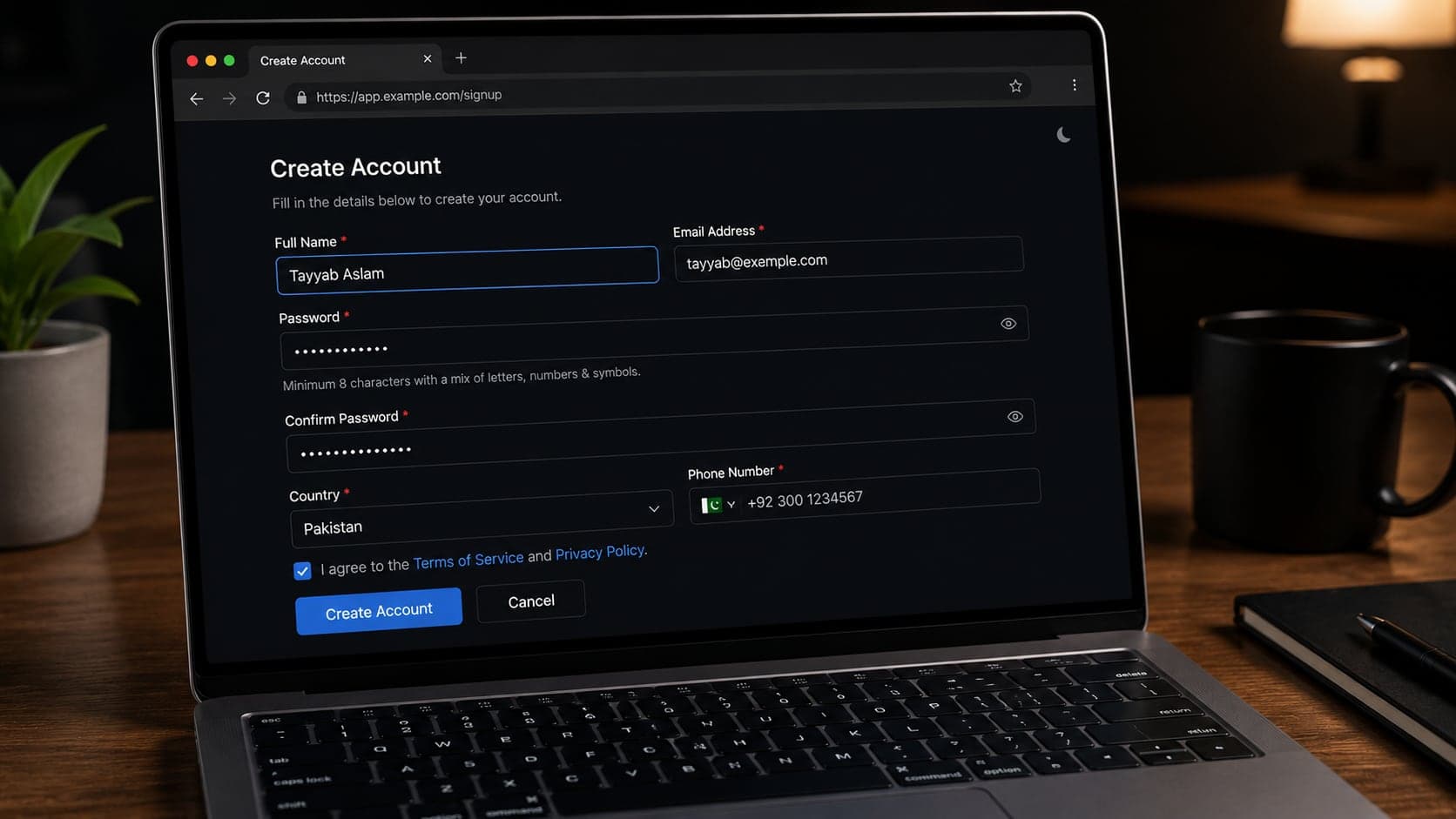
Forms are where validation, privacy, and clarity meet. Group related fields, mark requirements honestly, and show errors next to the problem — not only at the top of a long page.
Settings screens need findability. Dumping fifty toggles into one scroll teaches users to fear configuration. Search, categories, and sensible defaults reduce that fear.
Destructive actions need friction that matches risk: confirmations, clear consequences, and undo where feasible. Cute microcopy does not replace safety.
We design for real data: long names, missing optional fields, and partial saves. Placeholder-perfect forms hide the bugs users will hit first.
Dashboards
Dashboard and complex product UI design
Clarity under density.
Dashboards fail when every metric shouts. We prioritize the decisions the screen must support, then design hierarchy, filters, and progressive disclosure around those decisions.
Data-heavy interfaces need consistent table patterns, empty states, and filter logic users can reverse. Clever charts that confuse the job are not sophistication.
Role-based views matter. Showing every control to every user creates fear and mistakes.
We prototype critical workflows — create, edit, approve, export — not only the overview widgets that look good in a screenshot.
Performance of perception matters too: skeletons, pagination, and deferred panels keep dense tools feeling responsive while data loads.
Motion
Motion and feedback without noise
Using movement to explain state — not to decorate every click.
Motion should confirm what changed: a panel opening, a row updating, a success settling. Decorative bounce on every button slows power users and distracts from the job.
We specify intent in handoff — what animates, for how long, and what reduced-motion preferences should do — so engineering does not invent inconsistent timing.
Loading feedback must match duration. A spinner for a two-second save and a progress pattern for a long import teach different expectations.
If motion cannot be implemented soon, design still needs non-motion feedback: toasts, inline confirmations, and clear selected states.
Marketing vs product
Marketing site design vs product UI design
Related crafts with different success metrics.
Marketing pages persuade and explain. Product UI helps people complete recurring work. Mixing the two aesthetics blindly creates either a flashy app that is hard to use or a dull site that fails to convert.
We can align brand systems across both while respecting different density and interaction needs. Shared tokens do not require identical layouts.
If you need a marketing website build, that often pairs with web development. This service page focuses on product interface and experience design.
Clear scoping prevents a “redesign everything” brief from becoming an unmanageable blob.
Measurement
Measuring whether design improved the product
Connecting interface work to outcomes you can observe.
Before a redesign, capture baselines: completion rate, time on task, support tickets on the flow, or activation steps reached. Without a baseline, “it feels better” is the only scoreboard.
Not every aesthetic change will move revenue. We help you pick metrics that match the journey you redesigned — not vanity metrics from unrelated pages.
Qualitative sessions after launch catch issues analytics miss: hesitation, misread labels, and workarounds users invent.
Design debt should be tracked like engineering debt. Known inconsistencies left behind need an owner and a date, or they become the permanent product.
Content
Interface content and microcopy
Words as part of the interface.
Buttons, errors, empty states, and onboarding lines are UX. Vague labels force users to guess. Hostile errors make people leave.
We draft and refine microcopy inside the design files so engineering is not inventing tone under deadline pressure.
Content length is a layout constraint. Designs must survive real translations and long names, not only perfect English placeholders.
Tone should match product risk. A finance confirmation and a social like button should not sound the same.
When legal or compliance text is required, we design for readable placement instead of dumping walls of copy into a modal nobody finishes.
Collaboration
Working with product and engineering teams
Design as a partner in delivery, not a separate island.
Good design work includes checkpoints with product owners and engineers. Constraints discovered late — API limits, permission models, performance budgets — should reshape UI early.
We prefer shared backlog language: problems and outcomes, not only screen lists. “Improve activation” beats “make onboarding prettier” as a brief.
Standalone design engagements still benefit from a named engineering contact for feasibility questions. Without that, handoff quality drops.
You work directly with practitioners at Taylance Tech who can discuss both interaction quality and implementation implications.
Engagement models
How UI/UX engagements are structured
Commercial clarity for design work.
Typical shapes include a fixed redesign of a critical journey, a new product UI for an MVP, or a design-system foundation for an existing app.
Retainers fit teams that need ongoing design capacity across a roadmap. Short sprints fit validation bursts before a build phase.
Deliverables are defined in writing: which flows, which fidelity, which devices, and what “done” means for handoff.
If development will also be done with us, we align design and build calendars so files do not rot waiting for engineering.
Mistakes
UI/UX project mistakes we help clients avoid
Patterns that waste budget and trust.
Starting visual design before the primary flow is agreed.
Designing only the happy path and ignoring errors and empty states.
Collecting opinions without task-based review.
Building a huge component library before any real screens exist.
Treating mobile as a compressed desktop screenshot.
Handing over images instead of organized, named design files.
Changing brand direction every review without a decision owner.
Myths
Myths about UI/UX design services
Claims that distort buying decisions.
Myth: UI/UX is only about making things look modern. Reality: structure and clarity decide whether people succeed.
Myth: Users know exactly what they want if you ask. Reality: watching tasks reveals more than preference surveys alone.
Myth: A design system must be finished before any screen ships. Reality: systems grow from real product needs.
Myth: Accessibility is only a legal checkbox. Reality: it improves clarity and resilience for many users.
Myth: Good designers ignore engineering constraints. Reality: constraints are part of professional craft.
Choosing a partner
How to choose a UI/UX design partner
Questions that reveal maturity.
Ask how they structure discovery and how they handle disagreement. Ask what they deliver for handoff beyond pretty frames.
Ask how they design empty, loading, and error states. Vague answers often mean those states will be missing.
Ask whether they can explain tradeoffs to engineers. Design that cannot survive implementation discussion will slip in production.
Taylance Tech expects these questions. We would rather narrow scope than oversell a visual makeover as a product strategy.
Poor fit
When UI/UX design work is a poor fit
Honest stop signs before budget is spent.
If you only need a logo or brand guidelines with no product interface, a dedicated branding engagement may fit better than full UI/UX.
If the product problem is primarily broken backend logic, design polish will not fix trust. Fix the system behavior first or in parallel.
If stakeholders will not name a decision owner, reviews will loop forever. Design needs authority to conclude.
If the brief is “make it like [famous app]” with no user job defined, we will push for clearer outcomes before drawing screens.
If you need throwaway event graphics with no reuse, a lighter visual task may be enough — not a design system project.
Professional limits
Professional expectations for UI/UX delivery
What Taylance Tech commits to — and what we will not claim.
Expect structured discovery, clear flows, thoughtful interface design, prototypes suited to the decision, accessibility-minded patterns, and handoff assets engineers can use.
Do not expect guaranteed conversion lifts, guaranteed App Store featured placement, or claims that design alone will fix a weak offer. We design for clarity and measurability, not magic.
Do not expect unlimited revisions without scope boundaries. Exploration is planned; endless taste cycles are not a process.
Within those limits, UI/UX design should make your product easier to understand, trust, and build. That is the service we provide.
First engagement
A grounded first design engagement
What a serious initial project usually contains.
A grounded first engagement picks a critical journey or product area, defines success, designs structure then visuals, prototypes the path, and hands off with states documented.
It produces a small but real component set tied to those screens — the seed of a system — rather than an abstract library with nothing to attach to.
After delivery, you should be able to implement, test with users, and decide what to design next from evidence.
Only then do we expand into secondary journeys, marketing alignment, or a broader system overhaul.
- Primary journey named and scoped
- Decision owner identified
- Devices and breakpoints agreed
- Handoff format confirmed with engineering
Process
How our UI/UX design process works
A sequence that reduces taste wars and expensive rework.
Understand users and constraints
We clarify goals, audiences, success metrics, brand boundaries, and technical limits so design decisions have a job to do.
Structure flows and information
We map journeys, navigation, and content hierarchy. Wireframes settle structure before visual polish locks in the wrong layout.
Explore and refine interface directions
We develop visual directions, then converge on a system that can scale across screens — not a one-page hero that cannot extend.
Prototype and validate
Interactive prototypes support reviews and usability checks. Feedback arrives while changes are still cheap.
Handoff and design support
We deliver organized Figma files, states, and specs. We stay available to clarify edge cases as engineering builds.
Compare
Thoughtful UI/UX vs common shortcuts
What changes when structure and systems come before decoration.
| Criterion | With Taylance Tech | Common shortcut |
|---|---|---|
| Starting point | Jobs, flows, and constraints first | Visual polish on a broken journey |
| Consistency | Shared components and tokens | One-off screens that drift every sprint |
| Validation | Prototypes and task-based review | Opinions traded in comment threads only |
| Engineering fit | States, edge cases, and buildable patterns | Pretty frames that ignore empty and error states |
| Accessibility | Contrast, focus, and readable hierarchy planned | Accessibility treated as a late checklist |
| When design is overkill | We say so for tiny throwaway pages | A full system sold for a three-screen experiment |
Stack
Tools and methods we work with
Design and validation tools chosen to fit the product decision — not collected for a mood-board slide.
Figma
Design
FigJam
Workshops
Prototyping
Validation
Design tokens
Systems
Component libraries
Systems
User flows
UX
Wireframes
UX
Usability testing
Research
WCAG-minded patterns
Accessibility
Responsive layouts
UI
Design QA
Handoff
Developer handoff specs
Handoff
Fit
Who this UI/UX design service fits
Teams whose product success depends on clarity — not only on shipping more features.
- Founders preparing a product UI before or alongside engineering
- Companies redesigning a confusing app or dashboard
- Teams that need a design system their engineers can trust
- Product leaders who want prototypes to validate before build cost rises
- Marketing and product pairs aligning brand with usable interface patterns
- Organizations handing design to an internal engineering team with clear specs
Checklist
UI/UX design readiness checklist
Confirm these items before a design engagement so decisions can move.
- Primary user jobs and success metrics written
- Decision owner named for design reviews
- Current pain points or analytics themes listed
- Brand constraints and references collected
- In-scope journeys and out-of-scope list agreed
- Devices and breakpoints prioritized
- Engineering constraints and stack notes shared
- Content owners identified for microcopy
- Access to existing product or competitor examples provided
- Prototype review participants scheduled
- Handoff expectations confirmed (Figma structure, specs)
- Accessibility expectations noted honestly
- Timeline and revision boundaries understood
- How success will be judged after launch defined
- Next build owner ready to receive files
Related
Related services
Other ways we can help when your project spans more than one discipline.
FAQ
UI/UX design questions
Straight answers about process, handoff, design systems, accessibility, and feasibility.
Do you offer UI/UX design as a standalone service?
Yes. We partner with teams for product design on its own — delivering organized Figma files, prototypes, and component systems your engineering team can implement — and we can also continue into build when you want one partner across design and development.
What does your design process look like?
We clarify goals and constraints, structure flows and wireframes, refine high-fidelity UI, prototype critical journeys, then hand off with states and specs. Validation happens before engineering cost locks in the wrong path.
How do you keep designs feasible to build?
We design with components, states, and patterns that map cleanly to modern front-end work, and we involve engineering constraints early. Feasibility is part of the craft — not a surprise at handoff.
Do you create design systems?
Yes. We build practical component libraries and tokens rooted in real product screens, with enough documentation for teams to stay consistent as features grow.
Can you redesign an existing product without starting from zero?
Yes. Many engagements improve a critical journey or establish a system on top of what already exists, sequenced so you can ship improvements without a risky big-bang rewrite of every screen.
Do you handle accessibility in design?
We design with WCAG-minded practices such as contrast, focus visibility, and clearer structure, and we flag risks we see. We do not sell legal compliance guarantees; we improve the interface foundations that accessibility requires.
What tools do you use?
Figma is our primary design and prototyping environment, with supporting workshops and documentation as needed. Deliverables are organized for engineering handoff.
How do we start?
Contact Taylance Tech with the product area you want to improve, who the users are, and any timeline or engineering constraints. We respond with fit assessment and a proposed design scope.
Ready to discuss your product design?
Tell us which journey or product area needs clarity, who the users are, and any engineering constraints. We will give an honest read on fit, scope, and next steps.